This data says something, but it’s not what you think
People today have access to more data than ever before. Correlations are a useful way to identify relationships in these data. Many articles and classes teach ways to properly apply and interpret correlations.
Here, we take a different approach. What follows is a recipe for making spurious and useless correlations. In no way is this recipe meant to generate any serious work. Instead, it sets out some worst practices. If you find yourself doing any of these things as you mine data for the next big discovery, you should probably reevaluate your approaches and goals.
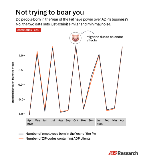
Kitchen-sink feature engineering
Feature engineering is a process by which raw data are transformed into understandable and useful signals before being used in models or downstream processes. Examples include labeling dates as weekends or holidays, differencing or log-transforming data, and converting continuous data into categorical data.1Log-transforming and differencing data are ways to “squish” data to make it better behaved. If you have data that spans many different orders of magnitude you can log transform it: 10 transforms into 1, 100 into 2, 1,000 into 3, and generally reduces a big N to the power to which you raise 10 to get N (10^2 = 100, 10^3 = 1,000). Looking at house prices or wages, for example, where a single big number (like $10 million) can throw off an analysis, analysts sometimes will log transform the data to make the numbers smaller and more manageable.
Differencing is used when analyzing repeated measurements of something taken over time. Sometimes it’s more useful to think about those measurements as a series of changes. Differencing transforms that time series into a series of changes by subtracting consecutive measurements.
These transformations should be done thoughtfully based on the data’s characteristics. If you apply every transformation to every data column out of desperation to find something new (or just for expediency), the chance of finding a strong correlation increases substantially, and the chance of that correlation being spurious increases even more.
Reduced degrees of freedom
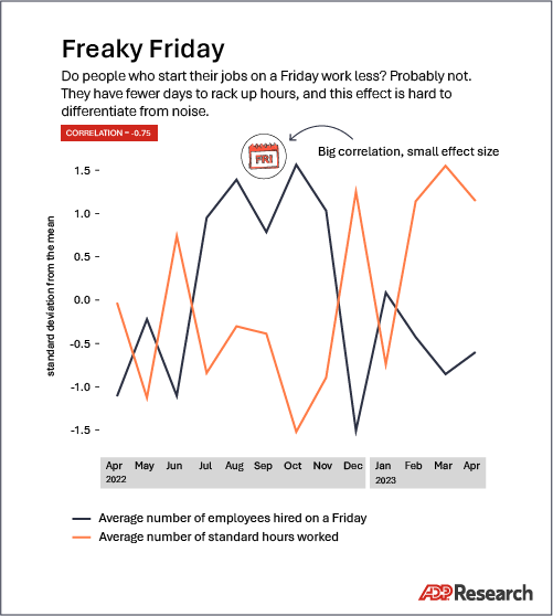
Compare two items, each of which has only two data points. Only three possibilities exist: Perfect correlation, perfect anti-correlation, or a perfect lack of correlation.
If you scattered a hundred pebbles on the floor, the odds that they’d all fall into a perfect line is just about zero. If instead you threw just two pebbles onto the floor, the chance you could draw a line that touches both is 100 percent. Decreasing the number of data points by summarizing and aggregating has a similar effect for correlation.
If you start with a year of data on the purchasing habits of a million customers, it might be challenging to find a strong correlation. To make things easier, you might tell yourself that you need to track only the monthly average of what all those customers spent. That big data set has now been reduced to just 12 datapoints. Correlations suddenly will appear everywhere.
Limiting the data domain
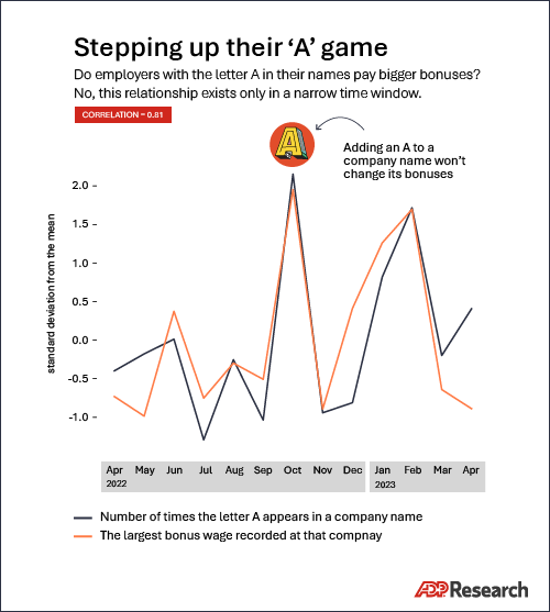
Correlations detect linear relationships, but data dependencies don’t always take a straight line. It can be tempting to limit an analysis to an area where the linear relationship is the strongest, but unless it’s clearly understood why the relationship should hold there and nowhere else, you’re setting yourself up for disappointment. The groundbreaking insights about the clickthrough rates of left-handed 45-year-olds with mild astigmatism will just have to stay unleveraged.
Data smoothing and winsorization
If you compare two series of random noise, you’ll almost always have a correlation very close to zero. But by smoothing both random series—averaging each random value with its neighbors—those same random series will look correlated.
The same thing can happen with real data series. In some cases, smoothing can induce correlation between unrelated data.
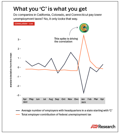
Correlations also are driven disproportionately by outliers, which is why data geeks use the process of winsorization to limit those extreme values. But any modification of outliers must be applied carefully and thoughtfully, because the process itself has a similarly outsized effect on the resulting correlations.
Comparisons galore
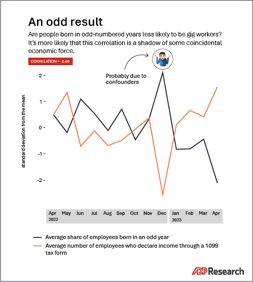
Your correlation analysis should begin with a line of reasoning. If you take everything from kitchen-sink feature engineering and look for correlations with every metric imaginable, your most likely outcome will be a big pile of tempting correlations. However, there’s a high chance that many of them will be spurious and therefore useless in practice.
Save yourself some work. Limit the scope of what you’re comparing to things which make sense and might reasonably be expected to be strongly dependent or causally related.
Conclusion
I’m not implying that all these techniques are irresponsible to use in every situation. In fact, I’m certain that some of these approaches have resulted in valuable insights that led to excellent business outcomes.
The key is to be thoughtful about how and when to apply these techniques. Decide ahead of time what’s appropriate based on the data and the goals of the analysis. Would someone who wasn’t hunting for a correlation process this data in the same way? An apparent dependency between variables which disappears when the data is processed slightly differently is a dependency that you shouldn’t depend on.
